
Knowledge Base
Articles In This Section
What Are Quickbase Dashboards How to Set Up Personalized Dashboards in QuickbaseHow to Create a Dashboard in QuickbaseHow to add a Webpage Widget (embedded iFrame) to your Quickbase DashboardHow and When to Use Calculated Columns for Quickbase Reports How to Create a Summary Report in QuickbaseHow to Utilize the Dashboard Side Bar in QuickbaseHow to Build an Operations Dashboard in Quickbase How to Color-Coding Rows for Quickbase Reports Using Automations to Log Approval Time and User in QuickbaseHow to Create External Stakeholder Forms, Reports, and Dashboards in QuickbaseHow to Update the Default Table and Report Columns in QuickbaseHow to Organize & Assign Groups to Quickbase ReportsHow to Link Dashboards Together in QuickbaseHow to Create Reports and Charts in QuickbaseHow to use Rich Text to Make your Quickbase Dashboard Dynamic Using Report Formulas as a Filter in a Report in QuickbaseHow to Create a Kanban Report in QuickbaseHow to Organize and Assign Groups to Quickbase ReportsHow to Use Report Formulas as a Filter in a Quickbase ReportUnderstanding and Setting Up Subscription Emails in Quickbase How to Create an Audit or Change Logs with Automations How to Build Standard Reports in QuickbaseHow to Add a Report to your Quickbase DashboardSections
How to Create a Pie Chart in Quickbase
A pie chart is a circular data visualization that represents values as slices of a whole. Each slice (or “sector”) shows the proportion of a category relative to the total, usually expressed as percentages. The entire pie equals 100%, making it easy to compare parts-to-whole relationships at a glance.
Quick Example: Consider the case of market share data of several streaming services.
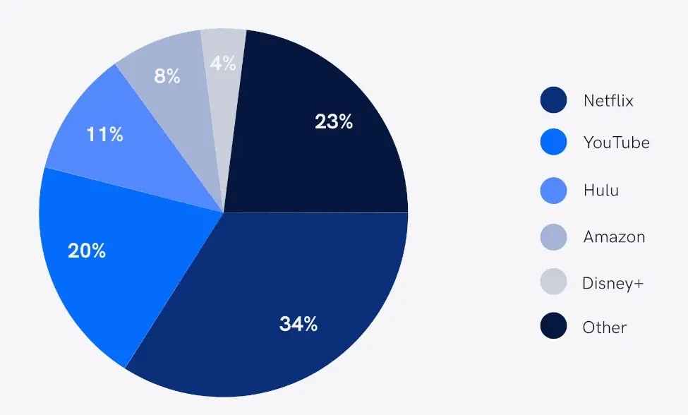
Assuming your raw data is in percentages, it makes more sense to render it using a pie chart (unless you have too many observations making the pie crowded – in which case you will revert to a bar or column chart).
Why Use a Pie Chart in Quickbase?
A pie chart in Quickbase is best used when you want to quickly visualize how different categories contribute to a whole—especially in dashboards, reports, and operational tracking.
1. Instantly Understand Proportions
Pie charts make it easy to see percentages and distributions at a glance. For example, you can quickly identify which sales region or project status dominates your dataset.
2. Ideal for Quickbase Dashboards
Quickbase is often used for real-time business reporting, and pie charts provide a simple, visual summary that fits well into dashboards used by teams across departments.
3. Great for Non-Technical Users
Pie charts are intuitive, making them perfect for stakeholders who need fast insights without analyzing raw data—such as executives, marketing teams, or operations managers.
4. Highlights Key Categories
They help emphasize top-performing segments (e.g., highest revenue source, most common issue type) without requiring complex analysis.
5. Supports Filtered, Localized Insights
In Quickbase, you can apply filters (e.g., by region, market, or timeframe), making pie charts useful for location-specific insights like:
- Sales by state or country
- Customers by region
- Project distribution by office
6. Enhances Decision-Making
By simplifying data into visual proportions, pie charts help teams make faster, data-driven decisions—a key benefit in business environments using Quickbase in the U.S. and globally.
When You Should Use a Pie Chart in Quickbase
Use a pie chart when:
- You want to show parts of a whole (must total 100%)
- You have a small number of categories (ideally under 7)
- You need a quick visual summary for dashboards
When NOT to use a Pie Chart in Quickbase
Avoid pie charts in Quickbase if:
- You need to compare small differences between values
- You have too many categories
- You’re analyzing trends over time (use a line chart instead)
How to Create a Pie Chart in Quickbase
Step 1: From the Table bar, choose a table you would like the Pie chart to live in.
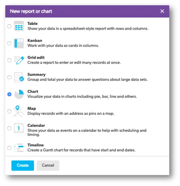
Step 2: Select Reports & Charts to open the reports and charts panel, then click +New.

Step 3: Select Chart from the list and click Create.
Step 4: Add a name and description.

Step 5: In the Reports & Charts panel section, determine who can see this chart.
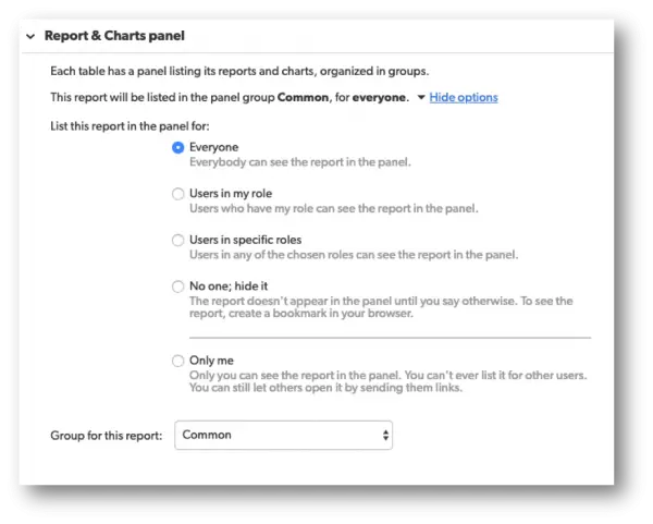
When you save this type of report, you will have several choices to choose from.
- Each option will have a brief description next to them to help you select the best option.
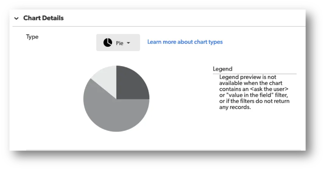
Step 6: In the Chart Details section, there will be a drop-down menu called, Select a type of chart. In this drop-down, select the Pie Chart option.
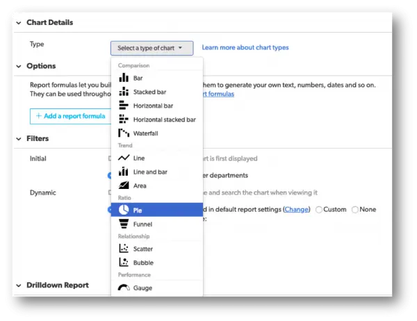
Once the chart type is selected, a picture of the chart type will appear in addition to a small section to the right known as the Legend with a brief description underneath.
Step 7: Within the Chart Details section, select a field whose values you want to display as the Series.
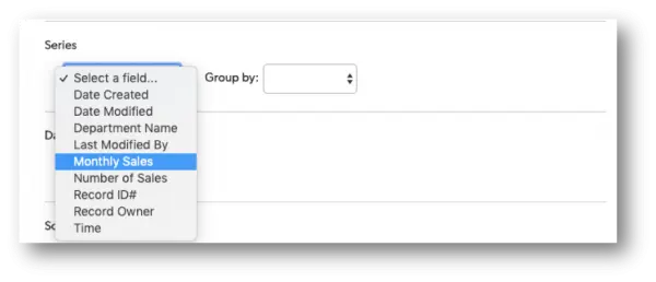
Quickbase allows the option on how to group the data from the field selected by using the Group By option.
- Use this drop-down to display the data in intervals or set amounts.
For example, if your pie chart features a numeric field, you can show amounts in groups of fives, tens, hundreds, or by dates of the month, quarter, or year.
Step 8: Within the Chart Details section, select the Data values you want to show.
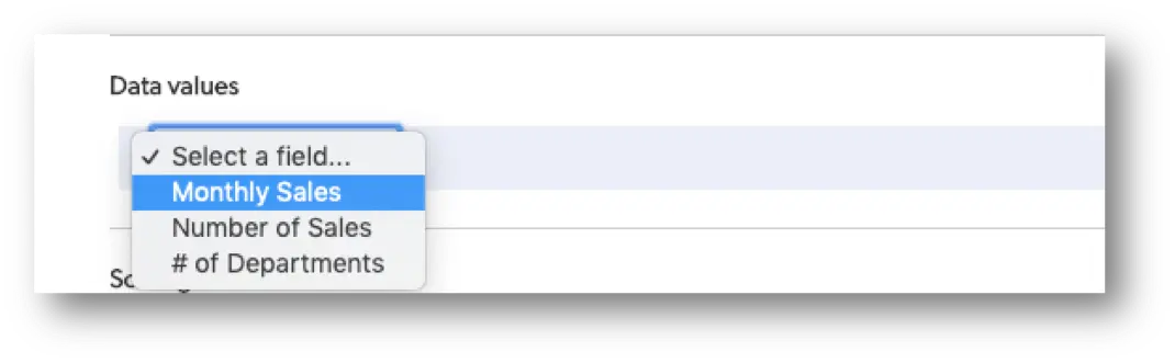
- Use the Data values section to select your measures and whether or not you want the sum or average of these values.
For example, you might want to show the annual or quarterly revenue of a company by department, or measure salesperson contribution by the number of sales.
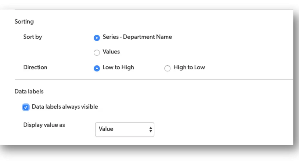
Step 9: Use the Sorting and Data labels sections to decide how to sort and display values in your pie chart.
Step 10: Use Filters to define the results.
Within the filter section, you can tell Quickbase what records to include. If you want your chart to show only a certain kind of record or only records that meet specific conditions, you can do so here.
For example, maybe you only want to show company revenue by the department in quarter three. Or, maybe you’d only like to see sales of a particular category of products, such as headphones, and not your other products.
- If so, this is the section where you can make all these adjustments within your chart.
FAQs about How to Make a Pie Chart in Quickbase
1. How do I create a pie chart in Quickbase?
To create a pie chart in Quickbase,
- Go to your Quickbase table (where the pie chart will go)
- click Reports & Charts
- Select New Report
- Choose Chart
- Pick Pie Chart as the chart type.
- Then, select a grouping field (e.g., category, status) and a value field (e.g., count or sum).
- Save the report to display your pie chart.
2. What data do I need for a pie chart in Quickbase?
- A categorical field (e.g., region, product type, status)
- A numeric field (e.g., revenue, quantity, or record count)
Quickbase automatically calculates proportions based on your selected fields.
3. Can I customize a pie chart in Quickbase?
Yes. Quickbase allows customization such as:
- Changing colors of slices
- Adding labels and percentages
- Adjusting grouping and filters
- Sorting slices by value
These options are available in the chart settings panel.
4. How do I show percentages in a Quickbase pie chart?
When editing your chart, enable data labels and choose the option to display percentages. This ensures each slice reflects its share of the total.
5. Why is my pie chart not displaying correctly in Quickbase?
Common issues include:
- Too many categories (causes clutter)
- Missing or inconsistent data
- Incorrect field selection (non-numeric values for totals)
Limit categories and verify your data fields for best results.
6. Can I filter data in a Quickbase pie chart?
Yes. Use report filters to display only specific data (e.g., by date range, region, or status). This helps create more relevant and localized insights.
7. How do I share a pie chart in Quickbase?
You can your pie chart in Quickbase the following ways:
- Add it to a dashboard
- Share a report link
- Embed it within Quickbase apps
This makes it accessible to teams across different locations and roles.
8. What are best practices for pie charts in Quickbase?
- Use 5–7 categories max
- Ensure totals equal 100%
- Label slices clearly
- Avoid very small segments
- Use filters for region-specific insights (GEO optimization)
9. Can I use Quickbase pie charts for business analytics?
Absolutely. Quickbase pie charts are widely used in U.S. business analytics, operations dashboards, and marketing reports to visualize proportions like sales distribution, project status, or customer segments.
10. Are pie charts in Quickbase mobile-friendly?
Yes. Quickbase dashboards, including pie charts, are optimized for mobile devices, allowing users to view insights on the go across different geographic regions.
- Author: April Barragan
- Title: Solution Consultant | Quickbase
- Email: abarragan@quandarycg.com
- Date updated: 02/01/2026

Industries
Resources


© 2026 Quandary Consulting Group. All Rights Reserved.
Privacy Policy