
Knowledge Base
Articles In This Section
What Are Quickbase Dashboards How to Set Up Personalized Dashboards in QuickbaseHow to Create a Dashboard in QuickbaseHow to add a Webpage Widget (embedded iFrame) to your Quickbase DashboardHow and When to Use Calculated Columns for Quickbase Reports How to Utilize the Dashboard Side Bar in QuickbaseHow to Build an Operations Dashboard in Quickbase How to Color-Coding Rows for Quickbase Reports Using Automations to Log Approval Time and User in QuickbaseHow to Create External Stakeholder Forms, Reports, and Dashboards in QuickbaseHow to Update the Default Table Home Page and Default Report Columns in QuickbaseHow to Organize & Assign Groups to Quickbase ReportsHow to Link Dashboards Together in QuickbaseHow to Create Reports and Charts in QuickbaseHow to use Rich Text to Make your Quickbase Dashboard Dynamic Using Report Formulas as a Filter in a Report in QuickbaseHow to Create a Kanban Report in QuickbaseHow to Update the Default Table Home Page and Default Report Columns in QuickbaseHow to Use Report Formulas as a Filter in a Quickbase ReportUnderstanding and Setting Up Subscription Emails in Quickbase How to Create an Audit or Change Logs with Automations How to Create a Pie Chart in QuickbaseHow to Build Standard Reports in QuickbaseAdding Reports to Dashboards | BEGINNERSections
How to Create a Summary Report in Quickbase
Summary Report – Background
Quickbase is capable of collecting enormous amounts of data. It's one of the reasons why Quickbase is so successful. Initially, a user can understand the information in a table using just a "List All" report.
Traditionally, as systems input more and more records, users need to build filtered reports to interpret the data. Eventually, a user can't understand the information in an app effectively.
On the other hand, Quickbase "Summary Reports" allow users to manipulate large data sets. As a result, users can better understand their app’s information.
Summary Reports group and total a table’s records by fields selected by the report builder. To better understand how Summary Reports can help users, read the example section below.
Summary Report – Example
Imagine a simple invoicing app that tracks invoice date, customer, and invoice amount.
At first, it is easy to view all invoices and find what you need as a user. As more invoices are entered, filtering by month or customer is sufficient. Eventually, though, there are too many invoices to be able to understand trends by using table reports.
Let’s build a Summary Report to help our users.
Summary Report – Navigation
- Navigate to the table home page
- Click on the ‘Reports and Charts’ dropdown arrow
- Click ‘New’
- Choose ‘Summary’ and then click ‘Create’
By default, Quickbase summarizes the # of invoices.

These choices will display a report that looks like this:
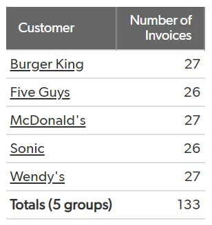
Knowing the number of invoices by customer is great. However, it would be useful to know the total amount per customer.
To accomplish this, in the Summarize Data section, add Invoice Amount.

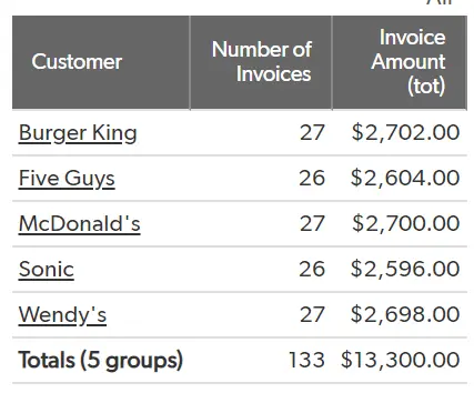
Next, you might want to see how the number of invoices and total invoice amount changes month to month. Simply add Invoice Month to the Grouping and crosstabs section.

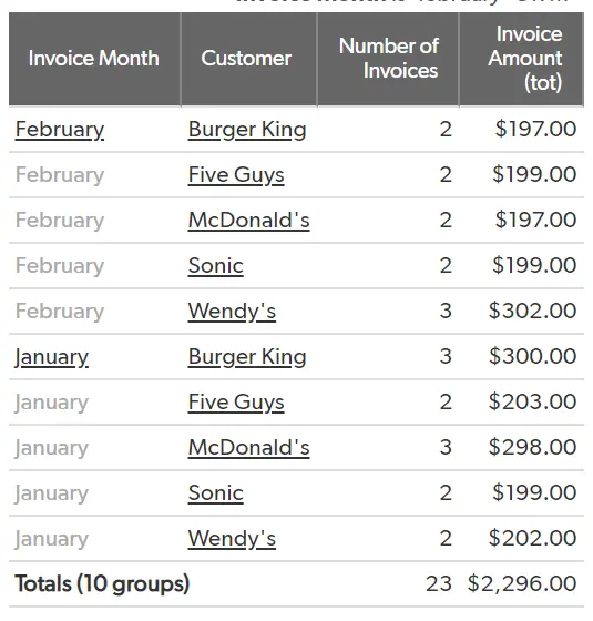
The above displays the necessary information. However, it is not easy to read as the months are repeated for each customer.
In this scenario, crosstabs are useful.
We can make Invoice Month the ‘crosstabs’ to better view the information. Now, months are displayed as columns and each customer is displayed in its own row and the data is much easier to read. Months and customers can be reversed if you would prefer customers as column headings.
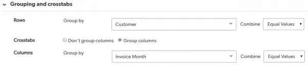
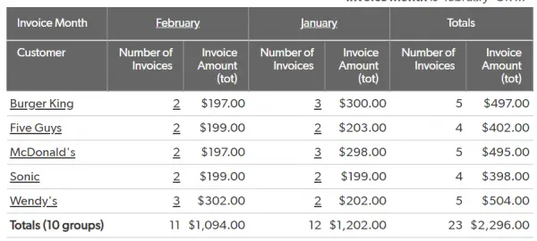
Any numeric field a user wants to total or average, take the minimum, maximum, or standard deviation can be added to the Summarize data section.
Also, any field can be used to group the data. Like other report types, in Summary Reports, filters can be added to remove unnecessary information. You can also add Dynamic filters to parse the data so it fits your needs.
If you want to learn more about filtering reports, check out the article, Updating the Default Table Home Page and Default Report Columns.
- Author: TJ Lawless
- Email: tlawless@quandarycg.com
- Date Submitted: 1/17/2018


Industries
Resources


© 2026 Quandary Consulting Group. All Rights Reserved.
Privacy Policy