
Knowledge Base
Articles In This Section
What Are Quickbase Dashboards Set Up Personalized Dashboards Using User-Filtered ReportsHow to Create a Dashboard in QuickbaseEmbedding an I-Frame (Webpage Widget) in a Dashboard | BEGINNERHow and When to Use Calculated Columns for Quickbase Reports How to Create Summary Report in Quickbase Utilizing the Dashboard Side Bar | BEGINNERHow to Build an Operations Dashboard in Quickbase | INTERMEDIATE to ADVANCEDHow to Color-Coding Rows for Quickbase Reports Using Automations to Log Approval Time and User in QuickbaseHow to Create External Stakeholder Forms, Reports, and Dashboards in QuickbaseUpdating the Default Table Home Page and Default Report Columns | BEGINNEROrganizing & Assigning Groups To Reports | BEGINNERLinking Dashboards Together | BEGINNERUsing Rich Text to make your Dashboard Pop | BEGINNERUsing Report Formulas as a Filter in a Report in QuickbaseKanban Reports | BEGINNERHow to Create an Audit or Change Logs with Automations Understanding and Setting Up Subscription Emails in Quickbase Create Audit/Change Logs with Automations | INTERMEDIATEHow to Set Up Pie Reports in Quickbase How to Build Standard Reports in Quickbase | BEGINNERAdding Reports to Dashboards | BEGINNERSections
Setting Up Report and Chart Types in Quickbase | BASICS
Reports and charts are effective tools to display and view your data in Quickbase and provide the valuable insight you need to improve processes, be more efficient, and plan the next steps.
The main challenge with using charts is selecting the correct type from the wide variety available in Quickbase. It can be difficult to understand the strengths and weaknesses of each chart and report type.
Many people will either decide off the cuff which looks the nicest or stay in their comfort zone by overloading their dashboard with table, pie, or vertical bar charts. It's important for users to use the most effective chart to display their data results.
This article will review basic report and chart types and when to successfully implement them into Quickbase. Let’s get started!
Benefits of Quickbase Reports and Charts
Reports and charts in Quickbase let you:
✓ Be more specific with which records you want to view.
✓ Place and order your records exactly as you want.
✓ Be creative in designing the layout and set colors to highlight your purpose.
✓ Allow users the opportunity to choose which data they want to see.
In this article, we will cover the following reports and charts available in Quickbase and when to use them. The reports and charts we will be discussing are:
✓ Table Reports
✓ Kanban Reports
✓ Summary Reports
✓ Grid Edit Reports
✓ Map
✓ Calendar
✓ Timeline
✓ Chart (such as pie, bar, horizontal bar, line, and area charts)
Quickbase Reports
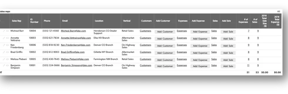
Table Reports
A table report is a list of records that consist of rows (each row is one record) and columns (fields). This is the most commonly used report in Quickbase and is great for listing records and managing/sorting data that best suits your needs.
To learn how to create a table report, see: Creating table reports.
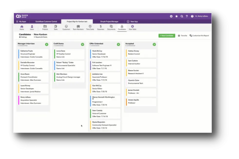
Kanban Reports
A kanban report helps you manage large teams or projects across multiple stages and resources. It allows you to instantly view, share, update and act on work-in-progress tasks.
They make it easier than ever to keep your teams focused and productive. You can display work items as cards organized in columns, and instantly update progress by dragging cards. Calculated fields, color, and filtering dynamically update in real-time as well.
To learn how to create a kanban report, see: Kanban Reports | BEGINNER
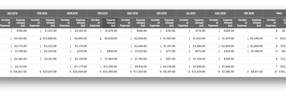
Summary Reports
Summary reports allow you to group and total records to help make sense of the data from many records in a table.
You can sort and group summary reports to specify which records should appear first, how all records should be ordered, and whether similar records should be grouped together.
To learn how to create a summary report, see: Creating a Summary Report | BEGINNER
Grid Edit Reports
Grid edit reports are derived from table reports, but give you a style similar to an excel spreadsheet where you can make changes at will. Grid edit reports are helpful to users in your app to enter data more efficiently.
Here are some features of grid edit reports:
✓ The ability to delete multiple records at a time
✓ Add multiple records at a time
✓ Directly modify multiple records at a time
✓ Fill down records
✓ Copy and paste between cells
To learn how to create grid edit reports, see: Grid edit
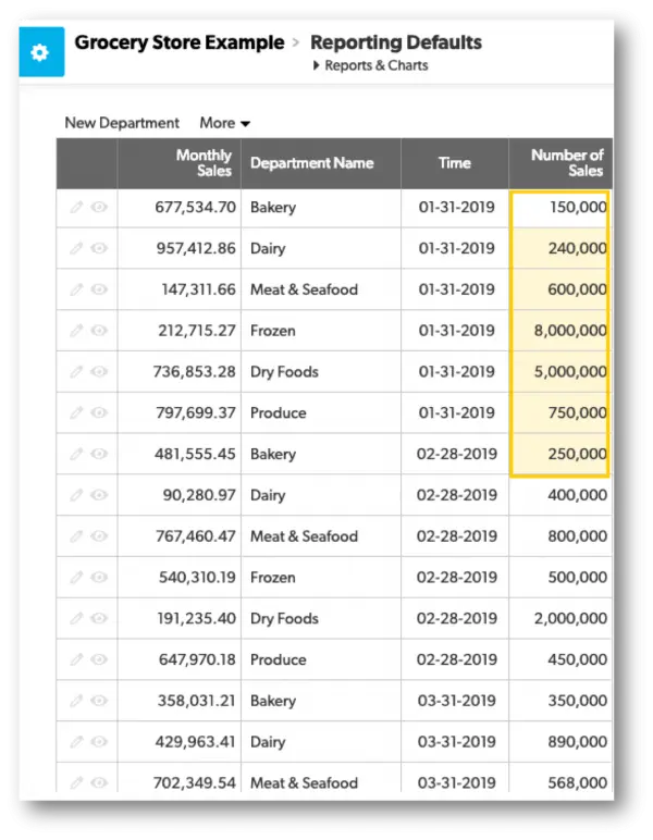
Map Reports
Map reports can be created using tables with at least one address field. In Quickbase, some features can make map reports unique.
For example, when viewing a map report, hovering or clicking on a pin shows a pop-up dialog with basic information about that specific record.
You can click edit to update a record’s information or view to review the record's information. Pressing the get directions button will provide standard map directions in a separate tab.
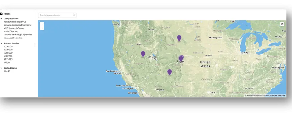
To learn how to create map reports, see: Creating map reports
Calendar Reports
Simply put, calendar reports let you view and manage all your events for a given day, week, or month in one place.
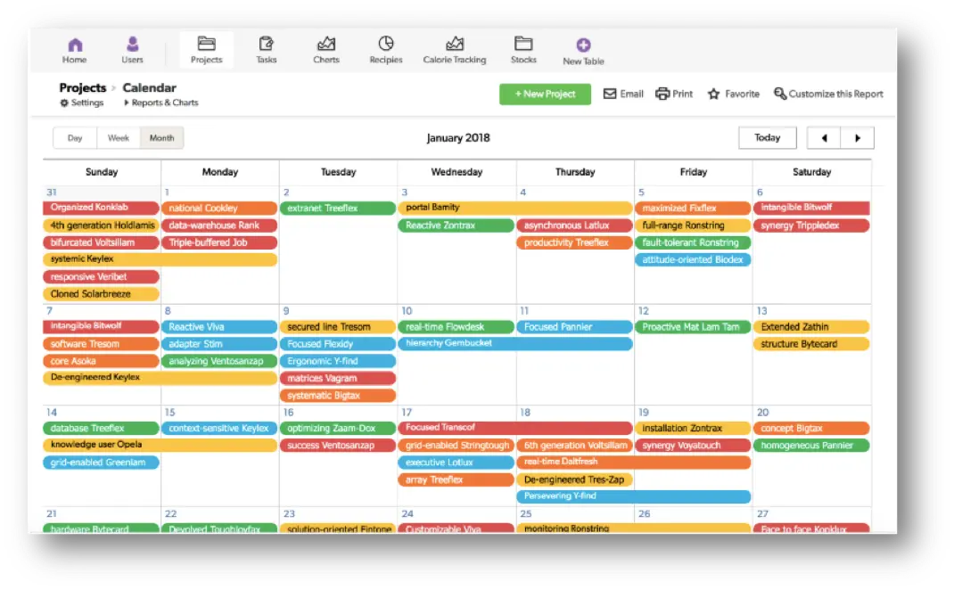
Here are some features you can take advantage of in Quickbase for calendar reports:
✓ Manage and switch between daily, weekly, and monthly views via tabs.
✓ Directly manage events in the calendar view.
✓ Ability to color-code events so you can tell at a quick glance what type of events or tasks are approaching. To learn more about color-coding in reports, see here: Color-Coding Rows in Reports | BEGINNER
✓ Ability to email calendar reports. This will send a report of the events that are visible to the sender.
To learn how to create calendar reports, see: Creating Calendar Reports
Timeline Reports
A timeline report is a graphic representation of records in relation to time. Each bar on a timeline represents the duration of an event based on the start/end times set.
Quickbase allows you to gather records into groups. Please view an example of a timeline report below.
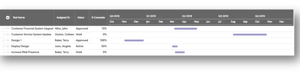
To learn on how to create a timeline report, see: Create a Timeline
Quickbase Charts
Pie Charts
If you want to show percentages in a certain category or any other type of proportional data, using a pie chart is a great way to illustrate this. For example, what department in a grocery store has the highest monthly sales?
Below you will find an example of what this might look like using a pie chart:
To learn how to create a pie chart, see: Getting Data into a Pie Chart
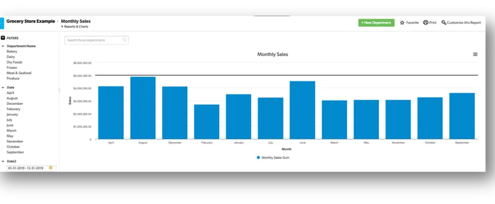
Bar Charts
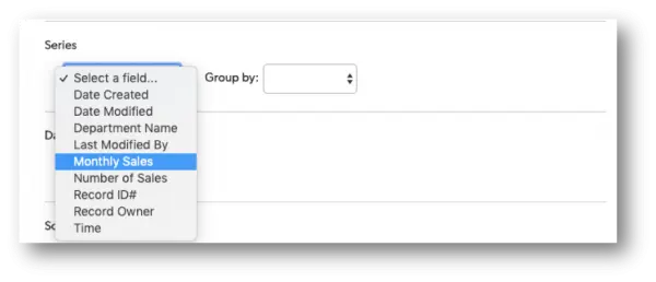
Bar charts are a great way to compare values. Which quarter was the best for business last year? Compare them all with a bar chart. Additionally, with bar charts, you can break down the bar chart data even further by using a series.
For example, if you owned a grocery store, in addition to comparing store sales for each month or quarter, you can include details like sales by department within each month.
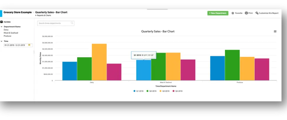
You can also add a goal line to a bar chart to measure performance against, for example, sales of $5,000,000 per month.
To learn how to create a bar chart, see: Get Data into Bar, Line and Area Charts
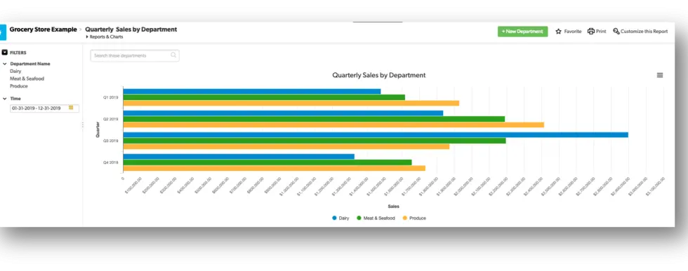
Horizontal Bar Charts
Horizontal bar charts are similar in format and purpose to a bar chart but turned on their side. It comes down to preference on how you would like to display your data between a bar or horizontal chart.
To learn how to create a horizontal bar chart, see: Get Data into Bar, Line and Area Charts
Stacked Bar Charts
Stacked bar charts are designed to help you simultaneously compare totals and notice sharp changes at the item level that are likely to have the most influence on movements in category totals.
For example, the image below shows monthly sales for the grocery store, just like the bar chart above.
The stacked bar chart below breaks each bar down into percentages by department, just like a pie chart would. The percentages stack up to form the total bar.
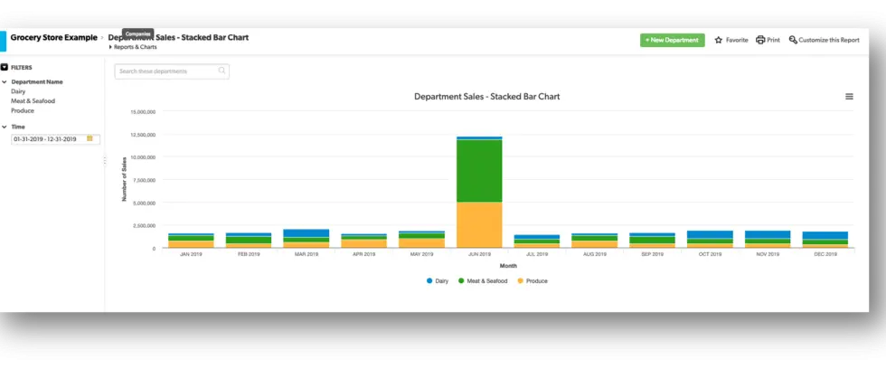
Remember that the main purpose of a stacked bar chart is to enable a better understanding of the big picture, without much focus on details such as light changes.
To learn how to create a stacked bar chart, see: Get Data into Bar, Line and Area Charts
Horizontal Stacked Bar Charts
Like the horizontal bar chart, pictured in an earlier example, a horizontal stacked bar takes in the same data as a stacked bar but flips the format on its side.
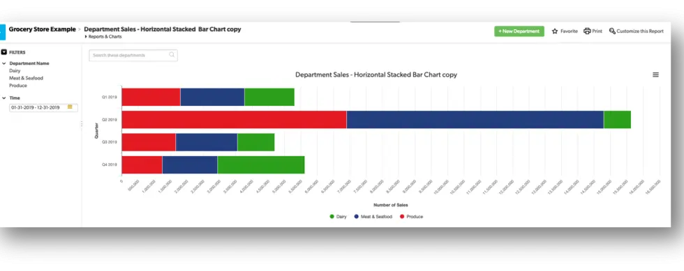
To learn how to create a horizontal stacked bar chart, see: Get Data into Bar, Line and Area Charts
Line Charts
The line chart is often used to visualize data changes over time by a series of data points connected with a straight line. Have sales of various products been increasing or declining?
The example below tracks a variety of grocery products over a period of a few months. In Quickbase, you have the ability to click each square to see the records that comprise that figure.
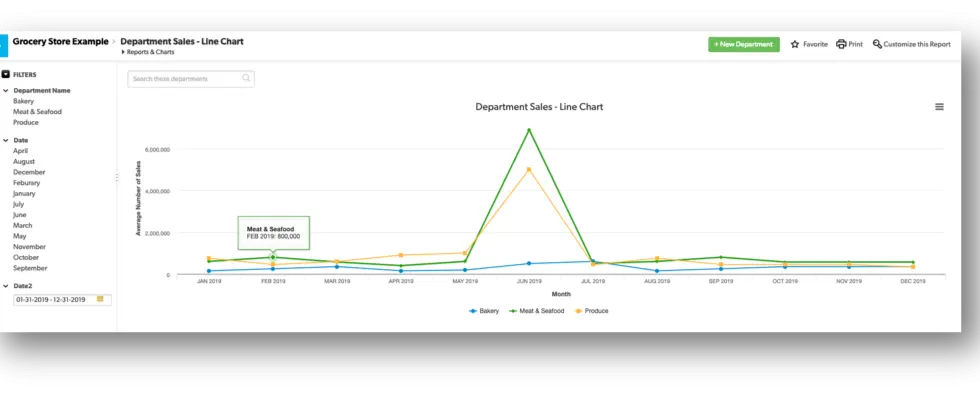
To learn how to create a line chart, see: Get Data into Bar, Line and Area Charts
Line and Bar Charts
A line and bar chart sounds exactly what the chart type is: a combination of features of both a bar and a line chart in one visual representation.
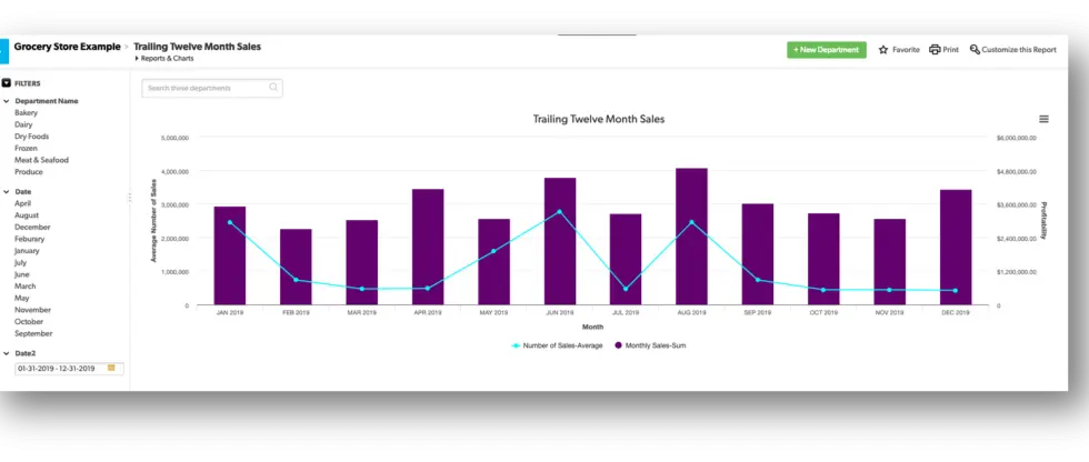
Here are some examples you might use a line and bar chart to:
✓ See how projects stack up against an average.
✓ Provide a quick view of profitability across an organization.
✓ Visualize seasonality in your data
✓ Identify high or poor functioning areas within your organization.
To learn how to create a line and bar chart, see: Creating a Line and Bar Chart
Area Charts
Think of an area chart as a combination of a line chart (track time component) and the proportion measurements of a pie chart. Area charts are a good choice to use when you want to show a trend over time but aren’t as concerned with showing exact values.
For example, should the grocery store continue to carry more variety of meat and seafood options, what percentage of sales do meat and seafood represent, and how have they performed over time.
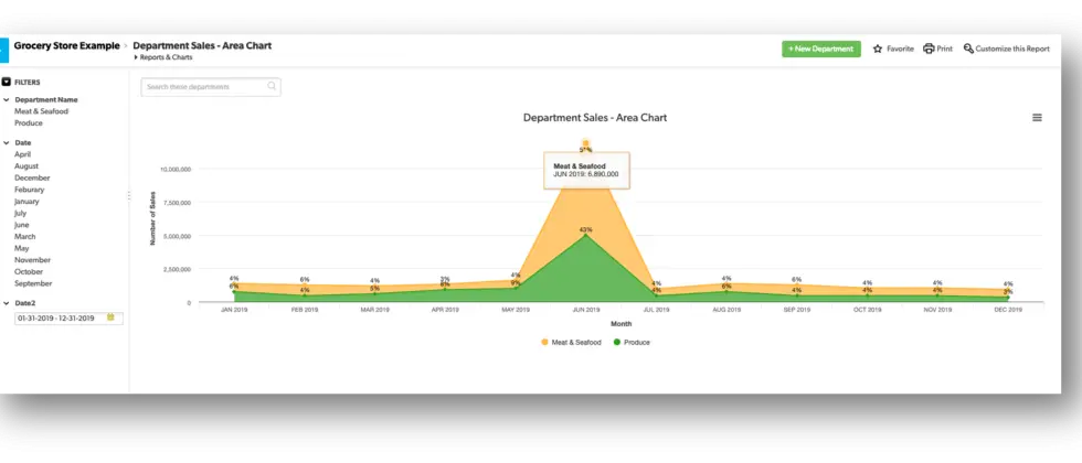
An area chart, such as the one above, can help you see the numbers clearly.
To learn how to create an area chart, see: Get Data into Bar, Line and Area Charts
Scatter Charts
Scatter charts (scatter plots) are used when you want to show the correlations and relationships within your data without regard to time.
This is a very powerful chart type that is effective when trying to show the relationship between variables (x- and y-axis). For example, a person’s weight and height. A good example of this can be seen below.
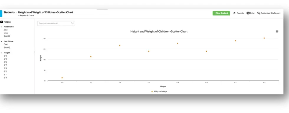
The data type in this chart is generally statistical or scientific and can suggest various kinds of correlations between the variables.
Remember, correlations have two properties, direction, and strength. The direction is determined by whether the correlation is positive or negative, and the numeric value is determined by the strength of a correlation.
To learn how to create an area chart, see: Creating a Scatter Chart
Bubble Charts
Similar to a scatter chart, bubble charts communicate two dimensions of data: one, a numerical value visualized in the scale of its circular bubbles, and second in what each bubble represents.
Simply put, larger bubbles equal larger values. Some good examples of when to use a bubble chart are:
✓ Prospective sales opportunities per week by dollar value, the probability to close, and stage in the sales cycle.
✓ Percentage of personal social networks and age range for those individuals.
✓ Compare median household income, life expectancy, and total population.
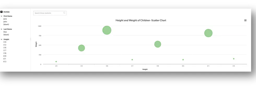
To learn how to create a bubble chart, see: Creating a Bubble Chart
Guage Charts
Use a gauge chart to measure progress against a goal that you set, as the total annual sales.
The gauge displays in a single color but based on how you set up the chart, you can have certain milestones within your goal be represented by a particular color to help visually determine where you are currently at with your overall goal.
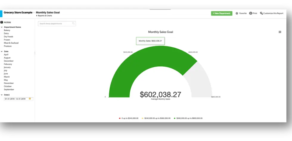
To learn how create a gauge chart, see: Creating a Gauge Chart
Funnel Charts
A funnel chart is traditionally used to display progress through any process. For example, represent stages in a sales process or show the amount of potential revenue for each stage.
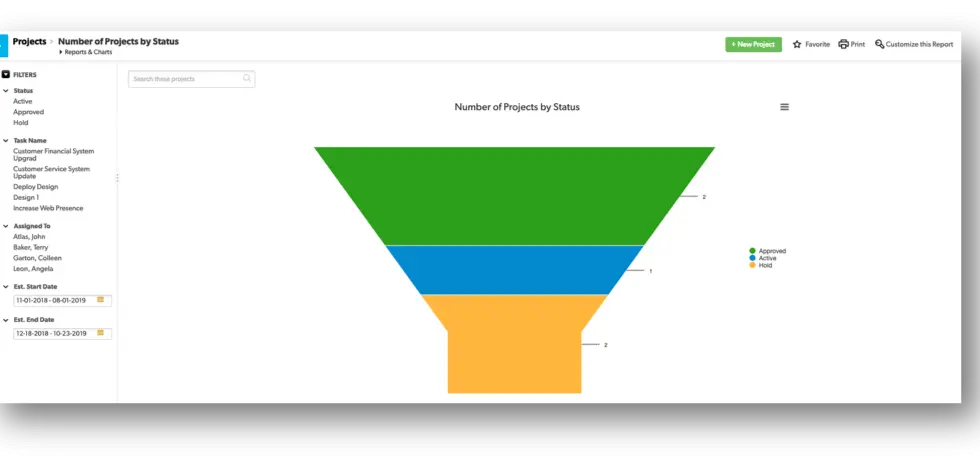
To learn how to create a funnel chart, see: Creating a Funnel Chart
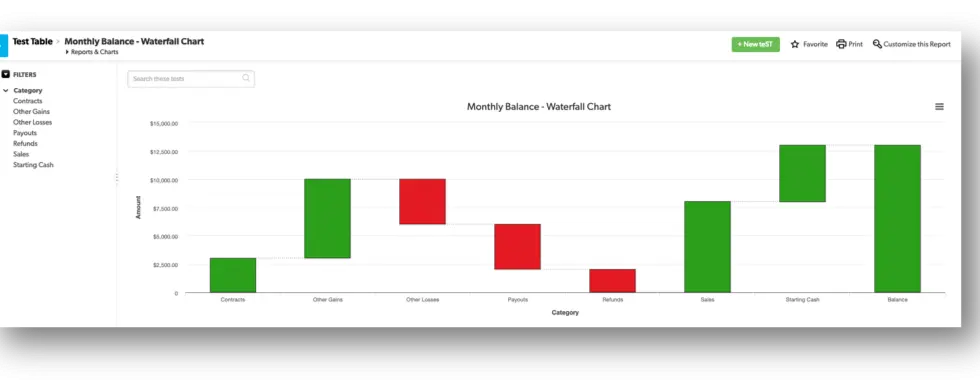
Waterfall Chart
A waterfall chart can be useful to illustrate a series of column graphs that show positive and negative values over time. The example below shows a starting amount, gains, and losses resulting in a closing balance:
To find out more on how to leverage additional Quick Base functions and features, take a look at the rest of our Knowledge Center: Knowledge Center.
- Author: Alex Skudrovskis
- Email: askudrovskis@quandarycg.com)
- Date Submitted: 3/11/2019

Resources


© 2026 Quandary Consulting Group. All Rights Reserved.
Privacy Policy