
Knowledge Base
Setting up Pie Reports in Quickbase | BASICS
What is A Pie Chart?
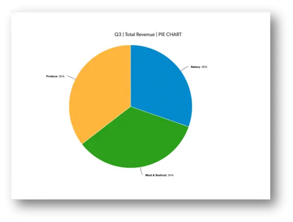
The central idea of the pie chart is that you’re comparing parts to the whole. Slices of different sizes are marked on a circle (i.e, the pie) based on what part of the whole they represent.
For example, say you have a grocery store with three departments, and you look at revenue from each. The sum of all the revenue figures is the same as your total revenue, and you can look at each department and see how much (i.e. the percentage) it contributes.
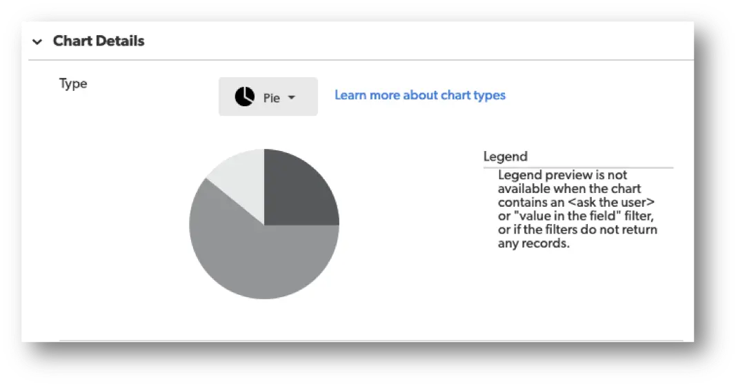
Below is an example of what this might look like:
Creating a Pie Chart in Quickbase
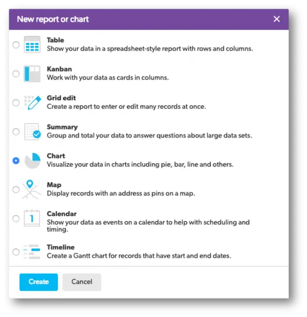
- From the Table bar, choose a table you would like the Pie chart to live in.
- Select Reports & Charts to open the reports and charts panel, then click +New.

- Select Chart from the list and click Create.
- Add a name and description.

- In the Reports & Charts panel section, determine who can see this chart.
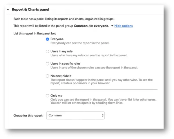
When you save this type of report, you will have several choices to choose from. Each option will have a brief description next to them to help you select the best option.
- In the Chart Details section, there will be a drop-down menu called, Select a type of chart. In this drop-down, select the Pie Chart option.
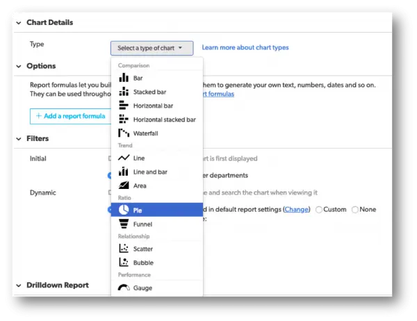
Once the chart type is selected, a picture of the chart type will appear in addition to a small section to the right known as the Legend with a brief description underneath.
- Within the Chart Details section, select a field whose values you want to display as the Series.
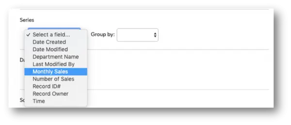
Quickbase allows the option on how to group the data from the field selected by using the Group By option.
Use this drop-down to display the data in intervals or set amounts.
For example, if your pie chart features a numeric field, you can show amounts in groups of fives, tens, hundreds, or by dates of the month, quarter, or year.
- Within the Chart Details section, select the Data values you want to show.
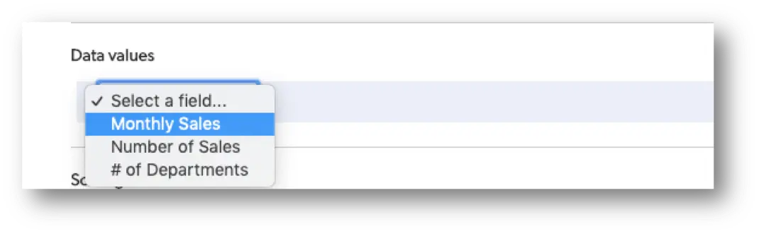
Use the Data values section to select your measures and whether or not you want the sum or average of these values. For example, you might want to show the annual or quarterly revenue of a company by department, or measure salesperson contribution by the number of sales.
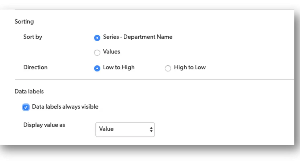
- Use the Sorting and Data labels sections to decide how to sort and display values in your pie chart.
- Use Filters to define the results.
Within the filter section, you can tell Quickbase what records to include. If you want your chart to show only a certain kind of record or only records that meet specific conditions, you can do so here.
For example, maybe you only want to show company revenue by the department in quarter three. Or, maybe you’d only like to see sales of a particular category of products, such as headphones, and not your other products. If so, this is the section where you can make all these adjustments within your chart.
To learn more ways to customize your reports in Quick Base, check out more articles here: Reporting & Dashboards.
- Author: Alex Skudrovskis
- Email: askudrovskis@quandarycg.com)
- Date Submitted: 3/20/2019

Resources


© 2026 Quandary Consulting Group. All Rights Reserved.
Privacy Policy