
Knowledge Base
Articles In This Section
What Are Quickbase Dashboards Set Up Personalized Dashboards Using User-Filtered ReportsHow to Create a Dashboard in QuickbaseEmbedding an I-Frame (Webpage Widget) in a Dashboard | BEGINNERHow and When to Use Calculated Columns for Quickbase Reports How to Create Summary Report in Quickbase Utilizing the Dashboard Side Bar | BEGINNERHow to Build an Operations Dashboard in Quickbase | INTERMEDIATE to ADVANCEDHow to Color-Coding Rows for Quickbase Reports Using Automations to Log Approval Time and User in QuickbaseHow to Create External Stakeholder Forms, Reports, and Dashboards in QuickbaseUpdating the Default Table Home Page and Default Report Columns | BEGINNEROrganizing & Assigning Groups To Reports | BEGINNERLinking Dashboards Together | BEGINNERSetting Up Report and Chart Types in Quickbase | BASICSUsing Rich Text to make your Dashboard Pop | BEGINNERUsing Report Formulas as a Filter in a Report in QuickbaseKanban Reports | BEGINNERHow to Create an Audit or Change Logs with Automations Understanding and Setting Up Subscription Emails in Quickbase Create Audit/Change Logs with Automations | INTERMEDIATEHow to Set Up Pie Reports in Quickbase Adding Reports to Dashboards | BEGINNERSections
How to Build Standard Reports in Quickbase | BEGINNER
Reports are a way to transform your data, depending on your ultimate goal. In Quickbase, we use reports to visualize data in charts, provide a numerical summary of data with Summary Reports, and shortlist data with Table Reports.
Reasons to Use Reporting
Reporting is vital to delivering data in a digestible format to an end user. Reports of each type serve different purposes for different audiences.
For example, some c-suite stakeholders might only need high-level summarization of data. In contrast, individual contributors might need more in-depth information about the data inside each record in QuickBase.
We tend to use reporting as one-off instances of data delivery, or as a component on a dashboard. As developers, we also use reports to assist in data validation and project management.
How to Create and Use Reporting
All projects will need reporting in some capacity as defined by the features of your Project deliverable(s).
During development, you will most likely create reports sporadically throughout the Project's lifespan to assist you and/or your stakeholders.
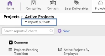
You can find Already-built reports on the “Reports & Charts” dropdown below the table bar:
How to Build Reports in Quickbase
In this example, we will create a Table Report to display records as rows.
Create a New Report Type and Name
- Find the “Reports & Charts” dropdown underneath the table bar
- Click the “+New” icon.
- You’ll see several choices:
- Table: Presentation comparable to a spreadsheet; records are displayed as rows with fields as the column headers.
- Summary: Presents data in the form of numerical summaries (For example, Number of projects by Status). If users want to see the data, they must click on numbers in this report or “Drill down”.
- Kanban: Displays records as cards on a board which has ‘buckets’ based on a single field (status, assignee, etc). This allows Users to drag + drop records between buckets to make simple edits (change the status, re-assign, etc).
- Chart: Graphical representation of data. This is what you’d click to make a pie/bar/line chart. You will be able to specify which type after making this selection.
- Map: Provided your data has [Address] information, will plot pins on a map.
- Calendar: Provided your data has [Date] information, it will plot blocks of time on a calendar. If your data has a [Start] and [End] date, the plots will span the duration.
- Select “Table”.
- Give your report a “Name” and “Description”. a. If you want to display your “Description” as a subtitle on your report, check the "Show Description on the Report Page" box.
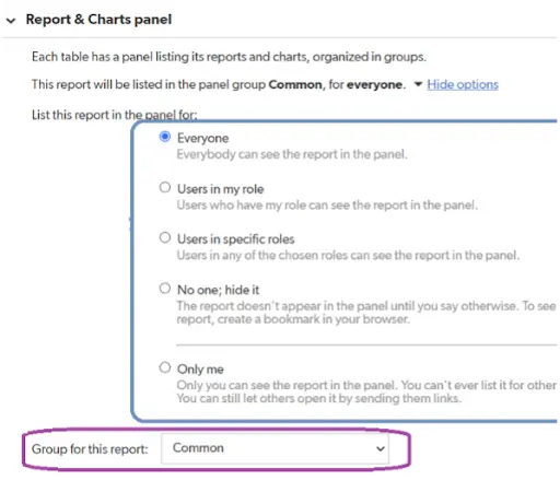
Reports & Charts Panel
The Reports & Charts Panel is where you can define who will see your report.
This is important for the cleanliness of your report structure. It also allows you to restrict visibility if this is a personal report or if it is inappropriate for users of a certain role to access the data.
By default, the report group will be selected as “Common”. Please note that “Common” may also be your only possible selection.
Note: Once we get into the organization of reports, this will come into play.
Columns to Display
- Check the “Custom Columns” Box.
- Two boxes will appear below. The left box contains the fields available for you to pull into your table report as columns. The right box contains previously selected items.
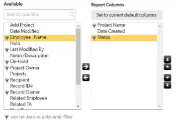
- Bring over the fields you would like to see in your report by either clicking and dragging them or double-clicking.
Note: Fields will display as columns on your report left-to-right starting at the top.
Note: For more advanced builders, “Report Formulas” will allow you to write functions to calculate data specifically for this report.
Setting Filters
Setting Filters is a crucial piece of report building. Filters allow you to limit the amount of data the system shares based on provided criteria.
How to set up filters:
- Check the option Filter Project Records option.
Note: There are instances where you would want to show all records.
- Start by leaving ‘All of these conditions are true’ as is.
- Next, choose the fields to act on for filtering.
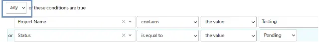
For this example, these are selected:
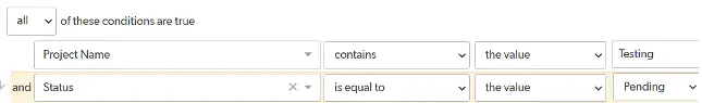
Explanation: This says, “Show records where [Project Name] contains ‘Testing’ AND [Status] equals ‘Pending’.”
- To add another row of filter criteria, hover your cursor over the right of your first filter row and click the blue “+” (plus sign). To remove a row, click the red “-” (minus sign).
- Alternatively, you could select:
Explanation: The phrasing now becomes “Show records where the [Status] is ‘Pending’ OR the [Project Name] contains ‘Testing’”.
Should your report call for it, we can add up to three layers of filters. To the right of one of your filters, you’ll see some icons:
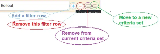
- Clicking the “Move to a new criteria set” will indent your current filter.
You’ll now be presented with another “Any/All of these conditions are true” wherein that logic will apply to only the filters in the newly-created criteria set.
Quickbase does a good job of visually representing this:
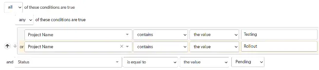
Here is another example: If you wanted to set up a filter that communicated this: “Show records where the [Status] is ‘Pending’, and the [Project Name] can contain either (‘Testing’ OR ‘Rollout’).
This is what the filters would look like:
Note: We are going through filters in the context of a Table report in this demo. However, the user experience and logic for filtering records are the same for all types of reports in Quickbase.
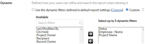
Dynamic Filters
These field choices will appear on the report page as quick ways to slice your report further.
You’ll see some options are selected by default. However, You can also choose “none” or “custom” and pick your fields.
Selecting “custom” will bring up a familiar-looking interface:
Sorting and Grouping
You can select the ‘Sort or group on other fields’ to bring up a field selection interface, similar to when you were building filters.
To add more layers of sorting or grouping, click the “+” (plus) or “-” (minus).
Here’s an example of what that might look like:
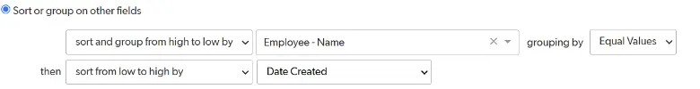
Note: Quickbase will interpret these instructions top-to-bottom.
In this example, Quickbase will first group records by [Employee Name] ‘A’ to ‘Z’. Within each grouping, the records will be sorted from oldest to newest.
Color Coding
This is useful for providing conditional formatting to records in your Table report.
Choosing “Assign colors to choices in” will allow you to select values from fields with choice-based values, such as multiple choice and checkbox.
For more advanced builders, “Use a formula” will bring up the interface for writing custom code that QuickBase interprets for color choices.
Reporting Best Practices
Consider your audience when creating a report.
Ask yourself:
- ◦ Is this an administrator-level report?
- ◦ Is it a personal report?
- ◦ Or is everyone going to want to see this?
These are controls in the “Reports & Charts Panel”.
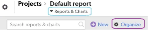
Setting Report Groups
You will need to consider the group in which your report should live. You can do this in the “Reports & Charts Panel”.
It is tempting to dump everything into “Common”. However, this leads to disorganization and confusion about the report's intended function or feature.
Here is how you add report groups:
- Leave the report building page and go into the “Reports & Charts” dropdown.
- Then, click “Organize”
- Add a description to your report.
Note: Information such as its purpose, who built it, etc. will greatly assist you or your team down the road. Sometimes, a name is not enough to jog your memory of why you built this report.
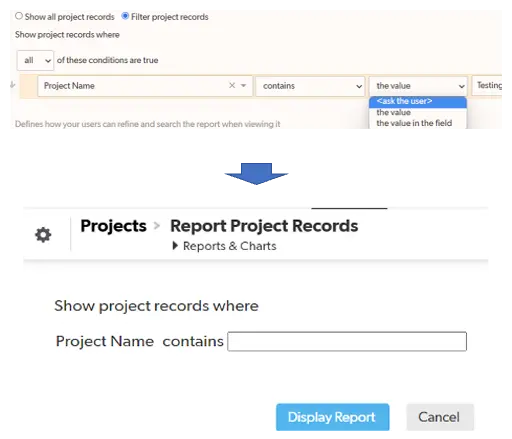
You can prompt the viewer of your report for input on a given filter before they view it.
To do this, click the dropdown and select “< ask the user >”
For more information, see the following:
https://helpv2.quickbase.com/hc/en-us/articles/4570317429908-About-Reports-and-Charts-
For more guides on Quickbase, visit our knowledge base.
- Author: Luke Neverisky
- Email: lneverisky@quandarycg.com
- Date Submitted: 6/6/2024

Resources


© 2026 Quandary Consulting Group. All Rights Reserved.
Privacy Policy