
Knowledge Base
Articles In This Section
What Are Quickbase Dashboards Set Up Personalized Dashboards Using User-Filtered ReportsHow to Create a Dashboard in QuickbaseEmbedding an I-Frame (Webpage Widget) in a Dashboard | BEGINNERHow and When to Use Calculated Columns for Quickbase Reports How to Create Summary Report in Quickbase Utilizing the Dashboard Side Bar | BEGINNERHow to Color-Coding Rows for Quickbase Reports Using Automations to Log Approval Time and User in QuickbaseHow to Create External Stakeholder Forms, Reports, and Dashboards in QuickbaseUpdating the Default Table Home Page and Default Report Columns | BEGINNEROrganizing & Assigning Groups To Reports | BEGINNERLinking Dashboards Together | BEGINNERSetting Up Report and Chart Types in Quickbase | BASICSUsing Rich Text to make your Dashboard Pop | BEGINNERUsing Report Formulas as a Filter in a Report in QuickbaseKanban Reports | BEGINNERHow to Create an Audit or Change Logs with Automations Understanding and Setting Up Subscription Emails in Quickbase Create Audit/Change Logs with Automations | INTERMEDIATEHow to Set Up Pie Reports in Quickbase How to Build Standard Reports in Quickbase | BEGINNERAdding Reports to Dashboards | BEGINNERSections
How to Build an Operations Dashboard in Quickbase | INTERMEDIATE to ADVANCED
In 2020, Quickbase introduced Dashboards to the platform. They are a significant upgrade from the home page feature, offering the ability to create a custom view of data from one or more apps. This makes consolidating information for your app users in an engaging and modern user interface easier than ever before.
This tutorial provides step-by-step instructions to create a simple operations dashboard that you can easily modify or extend to support several frequently encountered use cases. You’ll find this especially useful if you’re an intermediate or advanced-level Quickbase user.
Note: This article is not a comprehensive Dashboard user guide.
Dashboard Build Summary
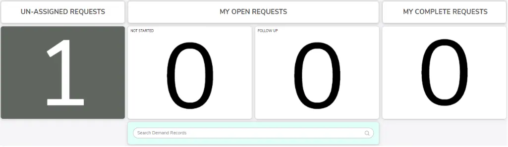
The dashboard built in this tutorial consists of eight elements.
Four of the elements require no preparation prior to building the dashboard. However, the four widgets displaying large numbers use chart reports that you must create in the tables where you store the counted records.
You can create this simple operational dashboard in less than one hour.
How to Build a Gauge Chart
If you can build gauge chart reports, you probably already know the following steps. These describe how to build a gauge to count records in a table.
- Navigate to the table that stores the records you wish to count.
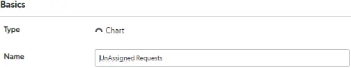
- Create a new report for the table and select “Chart” from the menu.

- Give the report a meaningful name.
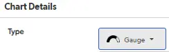
- Use the dropdown menu to select “Gauge” for the chart type. At the time of writing, “Gauge” is the last item on the list.
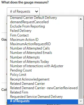
- Use the dropdown menu to select what the gauge will measure.
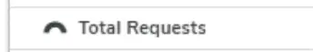
- Select the last item in the list to count the # of xx (what records in the table are called). In this example, the # of Requests are being counted in the Requests table.
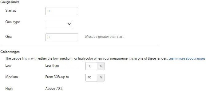
- Leave the Gauge limits and color ranges set to the default values. (You can adjust these settings.However, we will not cover them in this tutorial).
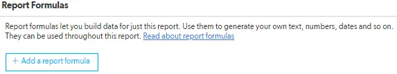
- You can also use report formulas. (However, we will not cover how to use them in this tutorial.)
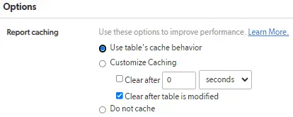
- Leave the Report Caching set to the default option: “Use table’s cache behavior”.
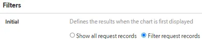
- Build filters as needed to target records that meet a specified set of conditions, such as request type and whether the request has been assigned.
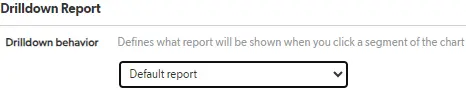
- IMPORTANT: Use the Drilldown Report dropdown to select the report that will be displayed when users click on the gauge. This report should contain the most important information the dashboard user needs to see when viewing records.
Create and Configure a Dashboard
The steps below describe how to create and configure a dashboard.
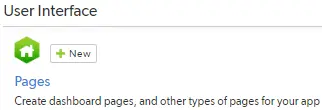
1. Navigate to the application settings of the Application where you wish to build the dashboard.
2. Click the + New button at the top of the pages section of the page.
3. Select Dashboard from the Create a New Page pop-up window. At the time of writing, Dashboard is the default option.
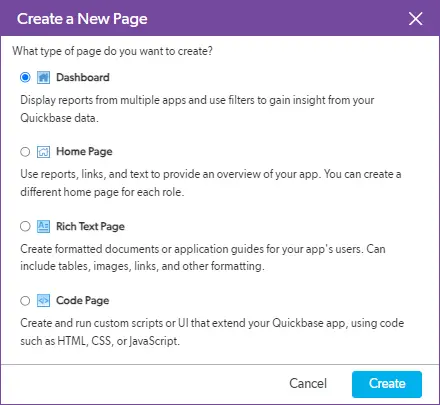
4. Click the Create button. The browser will refresh to display the new dashboard.
5. The dashboard will come unlocked (editable), so you can begin adding widgets immediately. You can use the icon in the upper-right corner of the page to toggle the page between the locked and unlocked states.

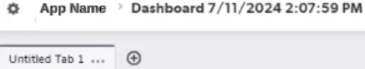
Note: The name of the page will follow the Quickbase default naming convention: Dashboard + date created + time created. We recommend renaming the dashboard to something more meaningful to help you and other users of the application distinguish it from other dashboards. You can do this by hovering the mouse pointer over the dashboard name to reveal an icon that allows you to edit it.

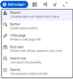
6. Click the Add Widget button to begin laying out the dashboard.
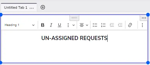
7. Select Rich text from the context menu.
This will add the widget to the page canvas so you can begin adding content to it. Its default position will be in the upper-left corner of the canvas.
8. Use the formatting tools inside the widget to apply styling to the text. Consider using text colors that match or complement your app’s branding color scheme for a more polished look.
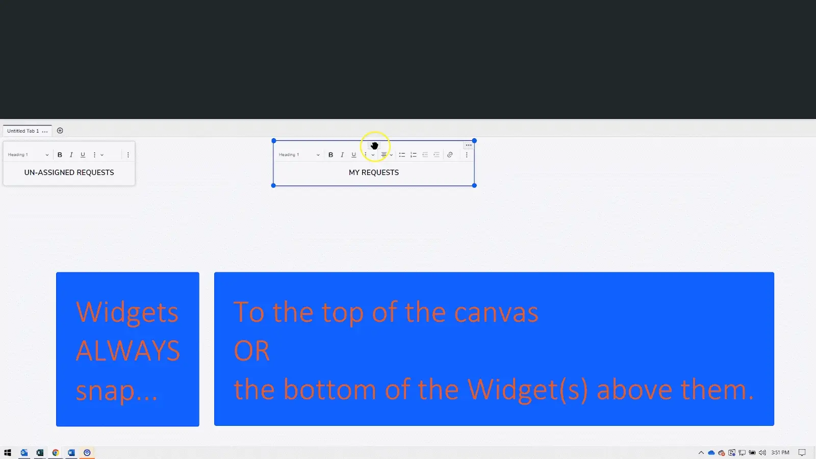
9. To resize the widget, hover the mouse over it, then click one of the blue circles to drag the anchor.
10. To move the widget, hover the mouse near the top center of the widget to reveal the handle. Then, click and drag the widget to change its position on the canvas.
Note: Widgets will always snap vertically and horizontally when you drop them. You can see on the gif below what you should expect when dropping widgets on the canvas.

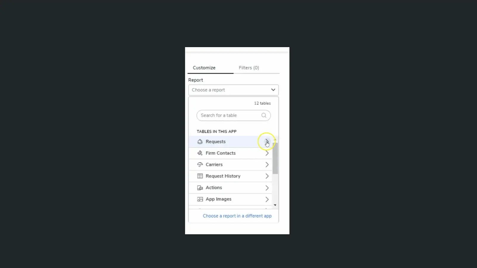
11. Select Report from the context menu.
12. The screen will refresh to display a report previewer and a UI to browse. You must select the report you would like to see on the dashboard.
- You may search for a table using the provided search bar.
- Click the chevron next to the table containing the report.
- Browse the list of reports from the selected table to choose a report.
13. Select one of the gauge reports created using the instructions above. An arc-shaped icon in the report list represents gauge reports.
The screen will refresh to display a preview with the selected report and a UI to customize how the report looks on the dashboard.
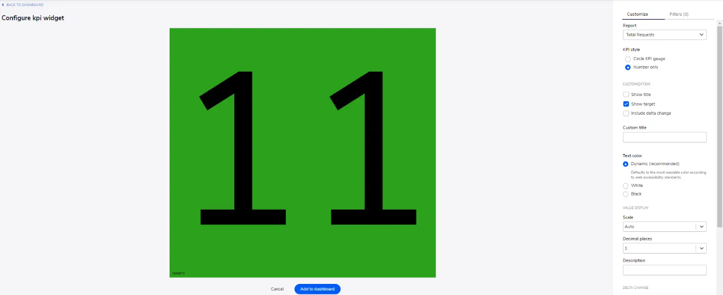
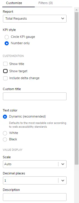
14. Use the Customize menu to replicate the settings shown below.
15. Configure the widget, then click the “Add to dashboard” button located in the lower center of the report preview panel.

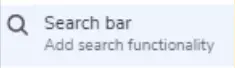
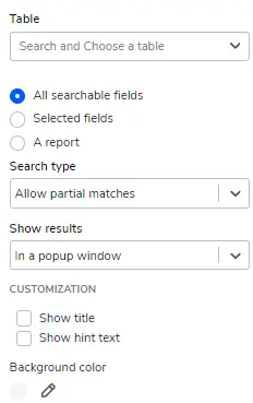
16. To add the Search Bar to the Dashboard, click “Add Widget”, then select “Search Bar” from the menu.
The screen will refresh to display a preview of the search bar and a UI to configure the widget.
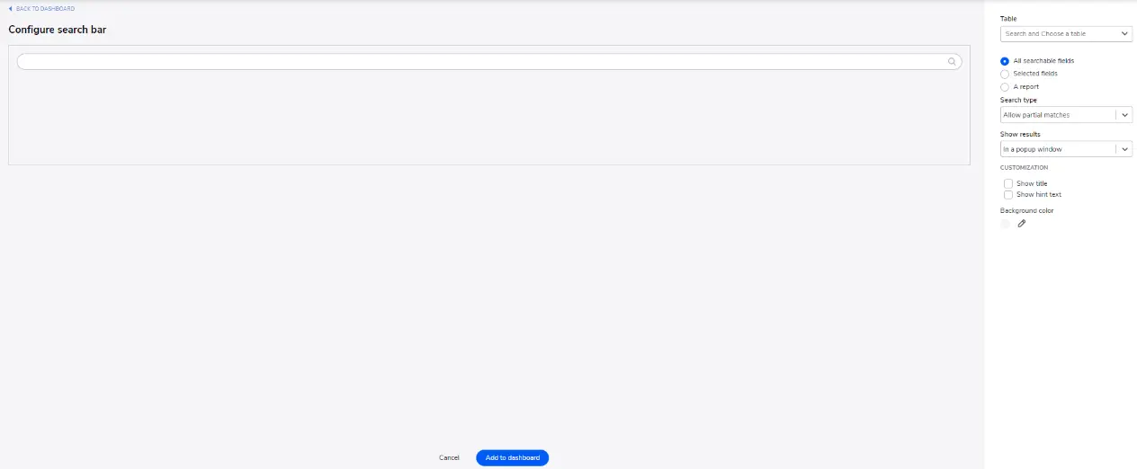
17. Use the customization UI to configure the widget then click the “Add to Dashboard” button located in the lower center of the preview window.
- Author: Jeff Richey
- Date Submitted: 8/5/2024

Resources


© 2026 Quandary Consulting Group. All Rights Reserved.
Privacy Policy